Here's a good little infographic about some of the misconceptions of evolution.

Showing posts with label infographics. Show all posts
Showing posts with label infographics. Show all posts
Friday, February 12, 2016
Top 5 Misconceptions About Evolution
Happy Darwin Day!
Here's a good little infographic about some of the misconceptions of evolution.
Here's a good little infographic about some of the misconceptions of evolution.


Friday, June 12, 2015
The Science of Beer Googles
It's Friday and you know what that means: Happy Hour!
Here's little infographic for your viewing pleasure all about the science of beer googles.
Here's little infographic for your viewing pleasure all about the science of beer googles.
- See more at: http://visual.ly/science-beer-goggles#sthash.X1vlduXe.dpuf

Tuesday, January 6, 2015

Thursday, August 14, 2014
What Type of Procrastinator Are You?
Joseph Ferrari is a master of procrastination. And by that I mean a Ph.D. in psychology who studies procrastination and task avoidance. Recently, the folks over at OfficeTime used Dr. Ferrari's findings to create a flow chart that helps you to identify what type of procrastinator you are.
Me? Well, I'm a Thrill Seeker.

You can find more over at Life Hacker and Science Dump.
Me? Well, I'm a Thrill Seeker.
You can find more over at Life Hacker and Science Dump.
Monday, March 17, 2014

Wednesday, October 16, 2013
Space Missions: Then, Now, and Future
A new way to follow my blog (in case there weren't enough already): Follow my blog with Bloglovin
To build on yesterday's on "The Integrated Space Plan," here are a couple of neat infographics about space travel. The first is the where-we've-been-where-we-are type that nicely lays out some of the history of space travel. The second details some future NASA missions (dates not taking into account any and all government shut-downs).

Courtesy of: Wish.co.uk experiences

Infographic via ScienceDump
To build on yesterday's on "The Integrated Space Plan," here are a couple of neat infographics about space travel. The first is the where-we've-been-where-we-are type that nicely lays out some of the history of space travel. The second details some future NASA missions (dates not taking into account any and all government shut-downs).
Courtesy of: Wish.co.uk experiences
Infographic via ScienceDump
Tuesday, October 15, 2013
The Integrated Space Plan
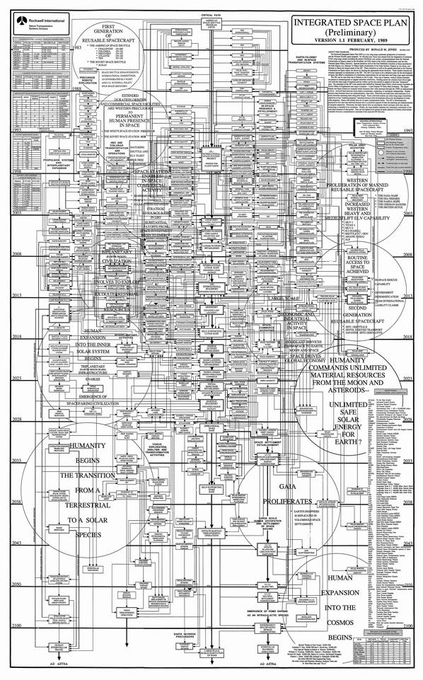
Sean Ragan of MAKE magazine posted this really cool graphic. It was created in the 1980's by analysts at Rockwell International and was called the “Integrated Space Plan.” Ragan had seen the poster in the late 90's and finally tracked it down last year. He was able to was able to connect with a generous donor willing to entrust an original copy of the poster to him long enough to have it scanned at high resolution.
So what is it? Essentially, it is a really really detailed flow chart for establishing a permanent human presence in space.
This is a small, pretty hard to see version. For a serious close-up, I recommend getting the PDF version (linked below) and taking some time to scroll around. At first glance it looks like your monitor has effed up with all the lines. But upon closer inspection you will notice that is organized chronologically from top to bottom, the arrowed lines denote “Evolutionary, Supporting, or Synergistic Relationships” and “Communication/Data Links,” and big circles are “Plateaus of Human Technological Achievement.” The nodes include goals like “Interstellar Traversing World Ships” and “Create New Moons for Mars If Required.”
Put simply, this is amazing!
Integrated Space Plan (.PDF)
Integrated Space Plan (.PNG)
Note: Should you decide to go with the PNG image, know that it is not large in terms of data, but in terms of pixels, it is huge: 16800 x 27000. That means that your browser may not be able to display the image. If this happens, try right-clicking on the link, selecting “Save as…”, and then opening it in a dedicated image-viewing and/or editing program.
Story Links:
Make's "The Rockwell International Integrated Space Plan"
Grist: "Exposed: Manufacturing conglomerate’s plan for moving humans off of Earth"
So what is it? Essentially, it is a really really detailed flow chart for establishing a permanent human presence in space.
This is a small, pretty hard to see version. For a serious close-up, I recommend getting the PDF version (linked below) and taking some time to scroll around. At first glance it looks like your monitor has effed up with all the lines. But upon closer inspection you will notice that is organized chronologically from top to bottom, the arrowed lines denote “Evolutionary, Supporting, or Synergistic Relationships” and “Communication/Data Links,” and big circles are “Plateaus of Human Technological Achievement.” The nodes include goals like “Interstellar Traversing World Ships” and “Create New Moons for Mars If Required.”
Put simply, this is amazing!
Integrated Space Plan (.PDF)
Integrated Space Plan (.PNG)
Note: Should you decide to go with the PNG image, know that it is not large in terms of data, but in terms of pixels, it is huge: 16800 x 27000. That means that your browser may not be able to display the image. If this happens, try right-clicking on the link, selecting “Save as…”, and then opening it in a dedicated image-viewing and/or editing program.
Story Links:
Make's "The Rockwell International Integrated Space Plan"
Grist: "Exposed: Manufacturing conglomerate’s plan for moving humans off of Earth"
Monday, September 16, 2013

Wednesday, August 21, 2013
Chandra's Interactive Guide to Stellar Evolution
NASA's Chandra X-ray Observatory is a space telescope specially designed to detect the X-rays that are normally absorbed by Earth's atmosphere. Because Chandra orbits above it, up to an altitude of 139,000 km (86,500 mi), it can detect these X-ray emissions that come from very hot regions of the Universe. Exploded stars, galaxy clusters, matter around black holes. Things that are invisible to the naked eye but show up in X-ray.
Now check out this really neat, interactive guide to stellar evolution from the Chandra X-ray Observatory. Through this interactive guide you can see examples of stars at various evolutionary stages, and what Chandra has learned about them.

Find the guide by going to the Chandra X-ray Observatory Website, clicking the image above, or copy this link (http://chandra.si.edu/resources/flash/stellar_evolution.html) into your browser.
Chandra also has a Facebook page
Now check out this really neat, interactive guide to stellar evolution from the Chandra X-ray Observatory. Through this interactive guide you can see examples of stars at various evolutionary stages, and what Chandra has learned about them.
Find the guide by going to the Chandra X-ray Observatory Website, clicking the image above, or copy this link (http://chandra.si.edu/resources/flash/stellar_evolution.html) into your browser.
Chandra also has a Facebook page
Tuesday, August 6, 2013

Thursday, June 27, 2013
Going to Mars...in Pixels
David Paliwoda is a Motion and Interaction Designer based out of East London. He has put together a website featuring a fantastic, animated, interactive infographic (what he terms a motion-infographic) that shows you the scale of the distance to the Moon and to Mars as measured in pixels.
Click the image to see the animated site. Or go to How Far is it to Mars?

Click the image to see the animated site. Or go to How Far is it to Mars?
Tuesday, April 16, 2013
What You Should Know About Dark Matter
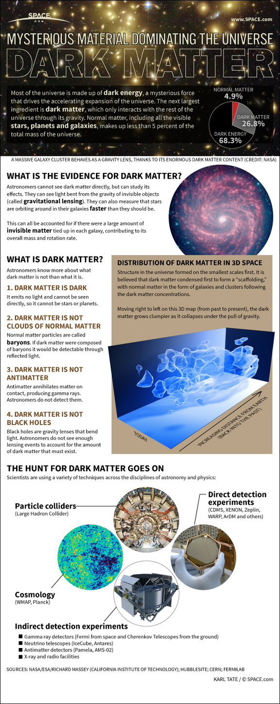
This is a really nice infographic about dark matter. You can find more over at SPACE.com including some great links to more information.
 Source SPACE.com: All about our solar system, outer space and exploration
Wednesday, April 10, 2013

Tuesday, March 19, 2013
The Character of Elements
Kaycie D. received her BFA from the Milwaukee Institute of Art and Design with a major in Animation and a minor in Illustration. For her senior thesis project she decided to take on a massive character design project that she called “Elements - Experiments in Character Design.” Her goal for this project was to design a character based on each of the known chemical elements in the Periodic Table. The project premiered at her school's Senior Thesis Exhibition from April 2011 - May 2011 for 72 of the elements, and she completed the remaining 40 elements in November of 2011.
I'll whet your appetite with a few of my favorite of Kaycie's Elements. You can see the rest over at her KCD blog and her tumblr page.


(via io9 and The Mary Sue)
I'll whet your appetite with a few of my favorite of Kaycie's Elements. You can see the rest over at her KCD blog and her tumblr page.


(via io9 and The Mary Sue)
Friday, March 15, 2013

Saturday, February 23, 2013
Friday, January 18, 2013
Navigating a Large Convention
This infographic was originally made for the International CES meeting, but I think it would work for some of those big science conference poster sessions as well.

(via Column Five Media Visual Storytelling)

(via Column Five Media Visual Storytelling)
Tuesday, January 15, 2013

Monday, November 12, 2012
The Science Behind Superheroes
Some superheroes are a bit more set in reality than others. This becomes arguably more or less the case when you talk about movies vs. comic books, one superhero vs. another. Perhaps, Christopher Nolan's new Batman, Jon Favreau's Ironman, or maybe the new Amazing Spiderman work with the laws of the natural world a little better. OK, well, only if someone really knows what an arc reactor is and how spiders can change you at a genetic level. We could probably argue this all day.
Anyway, here's a great little infographic that I came across about The Science Behind Superheroes. Enjoy!

(via GeekTyrant via AllFancyDress)
Anyway, here's a great little infographic that I came across about The Science Behind Superheroes. Enjoy!
(via GeekTyrant via AllFancyDress)
Friday, October 26, 2012


Subscribe to:
Posts (Atom)
